How to Read Pigment Labels: A Beginner's Guide to CI Names and Lightfastness
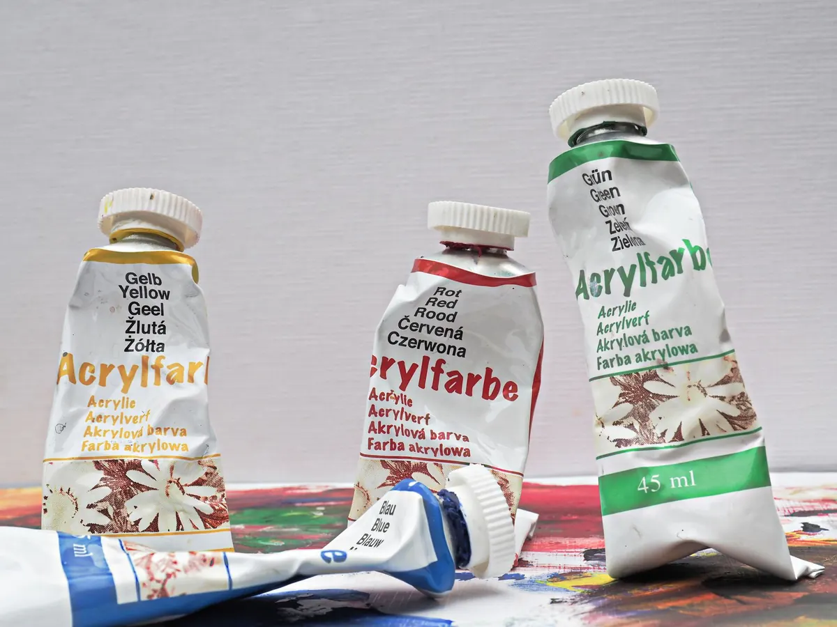
Most paint labels get read once, in the shop, usually while you are holding two tubes and trying to decide between them. The name on the front wins: "Permanent Rose" sounds dependable, "Rose Madder" sounds historic, and both go in the basket. The small block of letters and numbers on the side — PB29, PR108, Lightfastness I — stays a mystery for years, even though it is the part written for painters rather than shoppers.
None of it is difficult. Colour Index codes, opacity notes and lightfastness ratings are a shared international shorthand, and once you can read them you can pick up a brand you have never used before and know roughly what is inside the tube.
Start with the three things that matter
Nearly every artist's paint label is answering three questions: what is this colour made of, how will it behave on the surface, and will it still look the same in ten years? Most reputable ranges give you a Colour Index code, an opacity rating and a lightfastness figure, though they arrange them differently.
You will often see a series number as well. That only tells you where the paint sits on the brand's own price ladder — a higher series means a more expensive pigment to produce, not a better one. A Series 1 earth colour can be every bit as permanent as a Series 6 cadmium.
Decoding the Colour Index
The Colour Index International is a reference database maintained jointly by the Society of Dyers and Colourists and the American Association of Textile Chemists and Colorists. Every pigment used in artists' paint has a code made of two letters and a number. The first letter shows the type of colourant, which for paint is almost always P for pigment. The second letter tells you the hue family. The number was assigned when the pigment was registered, so it is an index, not a score.
- PB — blue, for example PB29, ultramarine
- PG — green, for example PG7, phthalo green
- PY — yellow, for example PY74, an arylide yellow
- PO — orange
- PR — red, for example PR101, a synthetic iron oxide
- PV — violet
- PBr — brown
- PBk — black, for example PBk11, mars black
- PW — white, for example PW6, titanium dioxide
Two tubes with the same code can still feel quite different. PB29 from one maker may be buttery and dense in oil, while the same code in a student watercolour pan can be weak and grainy. Binder, milling, pigment concentration and the form the paint takes all change the result. The code identifies the pigment; it does not promise the behaviour.
One code or several?
Check how many codes are listed. A single pigment is easier to predict in mixes and will not surprise you halfway through a painting. When you see three or four codes on one tube, you are buying a pre-made mixture, and mixtures are where mud happens. If the front of the tube says "Hue" — Cadmium Red Hue, for instance — it almost certainly contains no cadmium at all, just a blend built to look similar.
Opacity and transparency
Opacity decides how you use a colour. Opaque paints cover what is beneath them and make strong, solid shapes; they lighten mixes quickly. Transparent paints let earlier layers show through, which makes them ideal for glazing, optical mixing and rich darks. Many ranges print a rating near the code: opaque, semi-opaque, semi-transparent or transparent.
Titanium white (PW6) is famously opaque, which makes it useful for blocking in and covering mistakes. Zinc white (PW4) is noticeably more transparent, which is why portrait painters often keep both on the palette. Opacity is not a fixed property, either — a paint thinned with water or solvent becomes more transparent, and a thick layer covers far more than a thin scrape.
Testing a new tube
- Draw a thick line with a black permanent marker and paint a single stroke straight across it. If the line vanishes, the paint is opaque; if it reads as grey, it is semi-opaque; if it stays crisp, it is transparent.
- Mix a small amount with white. This shows you the tinting strength and whether the hue shifts as it lightens.
- Glaze it thinly over a dry patch of another colour, and note whether it muddies the layer or makes it glow.
Lightfastness: the rating that decides whether your work survives
Lightfastness describes how well a pigment holds its colour when exposed to light. Two scales turn up most often. The ASTM scale used widely in artist paints runs from I (excellent) down to V (poor), and paints rated I or II are the ones to trust for work you intend to exhibit, sell or hand down. The Blue Wool scale runs from 1 to 8, with 8 the most stable. Some manufacturers use their own star or plus system, so it is worth checking their website for
Photo: Ulrich Scharwächter / Pexels