Colour Temperature Without Jargon: A Simple Explainer for Painters
Ask six painters to sort a pile of swatches into warm and cool and you will get six different answers. Nobody is being difficult. Temperature is not a property a colour carries around with it, like a label on a tin. It is a relationship, decided by what sits beside a colour and what light is falling on it.
That is the whole idea. The useful part — the part that changes how you mix — is learning to see it quickly, then using it on purpose.
Warm and cool, in one paragraph
Warm colours lean towards red, orange and yellow. Cool colours lean towards blue, green and violet. The word doing the work there is lean. Very few pigments are purely one or the other. Lemon yellow is cool for a yellow; cadmium yellow is warm. Ultramarine is warm for a blue, because there is violet in it; phthalo blue is cool, because there is green in it; cerulean sits somewhere in the middle, as most things do.
So the question worth asking is never "is this colour warm?" It is "warmer than what?" The first has no reliable answer. The second always does.
Everyday temperature you have already noticed
You can read temperature without opening a paint box. Stand outside on a clear day and look at the shadow cast by a wall. It is not grey. It is usually a soft blue-violet, and it looks that way largely because it is being compared with the warm sunlight around it. The same shadow at dusk, with no sun on the wall, looks far less blue.
Now look at a white windowsill on a bright afternoon. The lit part leans warm, the shaded part leans cool, and both halves came from the same tin of paint. Nothing about the paint changed. The light did.
Indoors it runs on a smaller scale. A north-facing room feels cooler than a south-facing one, because the light arriving in it is cooler and more indirect. A wooden floor beside a steel table leg reads warm against cool. Noticing this is most of the skill.
The same colour, two temperatures
Once temperature is a lean rather than a category, pigment choices get easier.
Reds
Cadmium red leans warm: there is orange in it, and it stays clean when you push it towards yellow. Alizarin crimson leans cool, with violet in it, and it mixes convincing purples and deep shadow reds. Put a stroke of each side by side and the difference is plain. Blend them into one average red and you lose what made either of them useful.
Blues
Ultramarine is the warm blue. Mixed with a cool red it gives a soft violet; mixed with burnt sienna it makes beautiful greys. Phthalo blue is the cool one, strong enough to overpower almost anything it touches, and it heads towards green. If a sky mix keeps turning purple when you wanted green, the blue is your problem, not the yellow.
Whites and greys
White is not neutral either. Titanium white is dense and slightly cool; zinc white is cooler and more transparent. A warm orange lightened with white turns a little pinker and less hot. That is not a fault in the white. It is information.
Three mixing exercises that teach it faster than reading
- The grey ladder. Mix one honest neutral grey and split it into three puddles. Add the smallest touch of blue to the first, orange to the second, and leave the third alone. Paint three squares side by side, then step back a metre. The untouched grey reads warm next to the blue and cool next to the orange.
- One object, two lights. Paint an apple or a mug twice. In the first version make the lit side warm and the shadow cool. In the second, reverse it: cool light, warm shadow. Both can look convincing, but only one will match the light in the room you are standing in.
- Same mix, different neighbour. Paint an identical swatch of one mid-tone colour twice, in two places on the sheet. Surround one with blues and the other with oranges. The swatch never changed, and nobody looking at the finished sheet will believe that until they cover the surroundings.
Temperature lives in the comparison
Everything above points to one rule: a colour has no temperature on its own. If a shadow looks too blue, adding red is one answer. Putting a warmer colour beside it is often a better one, and it costs nothing.
This is why painters keep stepping back from the canvas. Close up, you judge one stroke at a time. Two paces back, you judge the relationships, and relationships are where temperature actually happens.
Four traps worth knowing
- Assuming white lightens without changing anything else. It lightens and it cools. If a mix goes dead as you add white, work a little of the original warm colour back in.
- Judging under whatever bulb happens to be on. Household
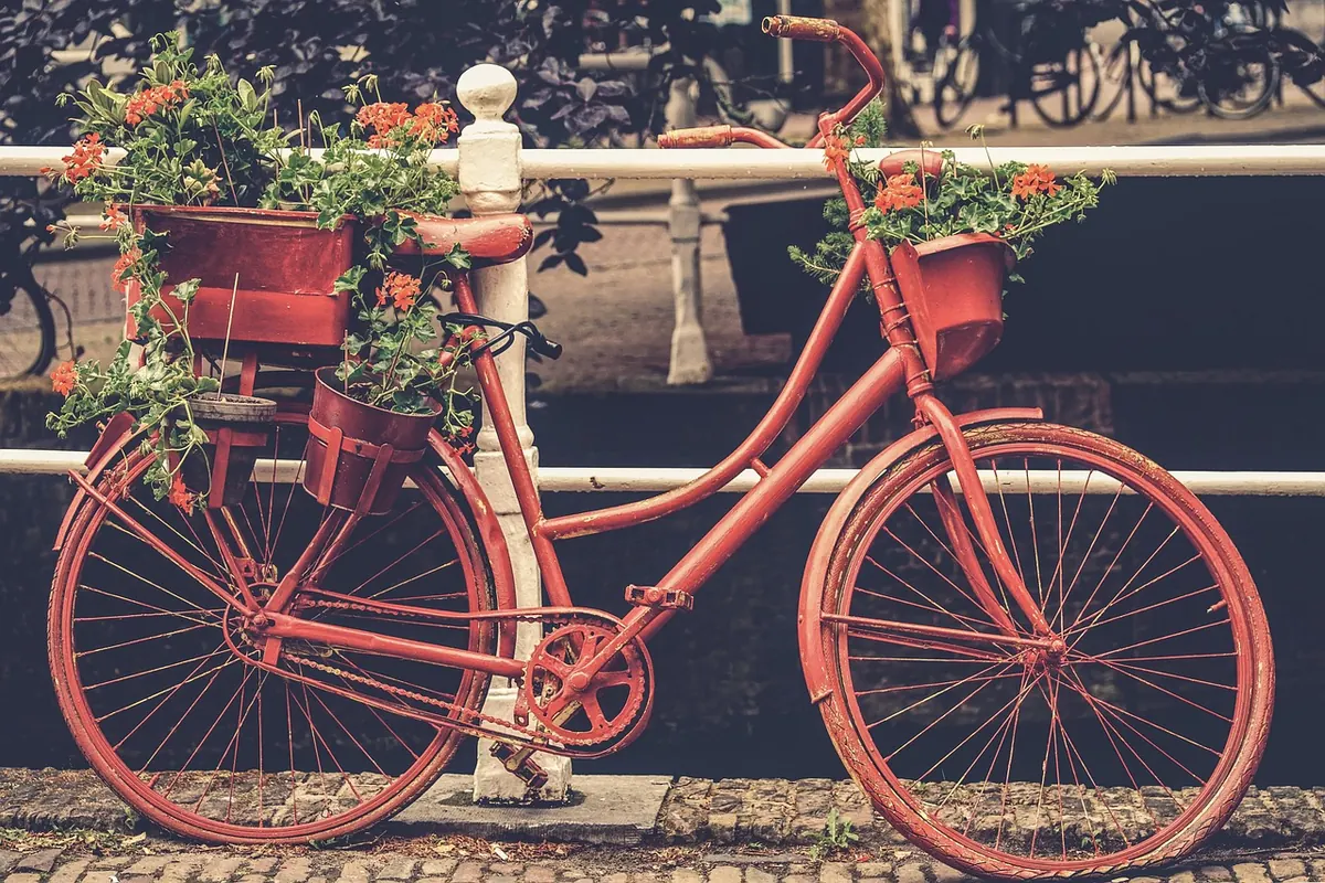
Photo: Kranich17 / Pixabay